"¿Qué es lo que hace a este conjunto algo singular y reconocible?"
-What every photographer should ask himself/herself (though, maybe not in Spanish)

Sixteen hours, all in Spanish, covering virtually all of the topics of basic digital photography. I'm sure you can guess that it was a lot of information crammed into one weekend. The history of photography, using your camera in the manual function, lighting, editing on the computer- the list goes on. I'll just touch on some of what I learned that really opened my eyes (that doesn't mean I'll be brief-- so if you're not a photo nerd, I'll try to give you another post to read shortly ;) ...

Zoom. Contrary to popular belief, a lens with zoom does not a better photo make. According to Rubén Serra, director of Filmosofía, and something I'd like to think is true; All of those people you see walking around nowadays with huge lenses- just about 100% of the time they don't know what they're doing. Professional photographers, unless they are capturing photos of animals or sports, do not use zoom lenses. In fact, using zoom does not only make the photo flatter (más plano), but also lessens the quality of the picture. Whereas with fixed lenses the light only has to travel through five lenses, light passes through twelve lenses twelve in a zoom óptica. You can't beat fixed lenses, say Rubén. 18mm for landscapes, 35mm for a full-body portrait, 85 for portraits and, a-la Cartier-Bresson, the star of the fixed lenses: the 50mm.
So I guess you can guess what I'm asking for for Christmas.
My days of using "Auto" are long gone. After a review on the aperture and shutter speed, I'm back in the game. Not only are my photos crisper and hardly ever over-exposed, but I feel so much more in charge of the photo I make... I mean, duh. But something I wasn't aware of was that Auto really does not work indoors and in direct sunlight. For these environments, along with harsh shadows and cloudy days, you have to change the settings for the white balance. Inside light will no longer be orange, and direct sunlight won't turn out blue. Hah!

Another setting I wasn't aware of- ISO. Set to 200 for night-time pictures to avoid grainy photos.
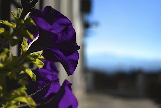
Speaking of using the camera in manual- often you can't make the shutter speed as fast as you want because the aperture won't open far enough. When it comes to the aperture on a lens, you get what you pay for. Most lenses don't go past 2, which allows for VERY little depth of field. Mine barely goes under 4. Still does the trick most of the time.

One thing I realized about this photo class is I suddenly have a very long, very expensive shopping list. On that list are filters and a tripod. I've always wondered how people can get the shutter speed to be low enough to take those photos of moving water in which the water looks smooth and flowing. You have to control the amount of light that enters the camera to achieve such a slow shutter speed in daylight. By using a shaded filter and a tripod, less light enters the camera allowing you to slow down the shutter speed and capture said photo. There are also polarized lenses when you don't want a reflection, or graded filters that shade the sky but not the ground (to avoid overexposure of the sky). Pretty neat stuff.
Composition. We quickly covered the topic (as with just about everything), and I realized that what I was doing without thinking is actually all part of the guidelines of photography composition.
Take for example, the rule of thirds. I knew positioning the subject in the center of a photo wasn't appealing to me, but I had forgotten about the rule that says you should place the most important elements of a photo along the lines (vertical or horizontal) that divide the picture in three parts each way.
Then there's the direction the eye moves along the photo, guiding the photographer in how to position the various elements. We read from left to right, so our eye tends to move first from the top left down to the bottom right. If you look at magazine ads, the majority of them place the product on the bottom righthand corner, in hopes of leaving a lasting impression.
The "interference" is usually placed in the bottom lefthand corner. Looking through my photos, I have a tendency to do this. In fact, the picture I took right before coming to class had an out-of-focus flower in that position as the "interference." But who knew there were guidelines saying to do the same thing?
I'll just list a few more rules I thought were interesting to take into account: The "ley de la mirada" says that the photographer should leave space in the direction that the subject is looking. The space above the subject's head should be treated as if he/she is wearing a halo-- leave the space open! I often forget this, then look back at my photo and realize the subject is wearing a tower of the Alhambra as a hat, for example.
Obviously, these are just guidelines; it's up to the photographer to break the "rules" and make the photo unique.
Lighting. In portrait photography, I won't forget this: "Cuanta más grande, más blanda" and "cuanto más pequeño, más dura." Translation: The bigger the light, the softer the shadow, and the smaller the light, the harsher the shadow. Think about it- the sun's light is a "small" light far up in the sky. The shadows created by the sun are very harsh and defined. If the photographer wants a softer shadow, he/she must make the light "bigger" using an umbrella, soft box, or simply bounce the light of the flash off the walls. When it comes to soft and hard light, it's not about the brightness of the light, it's about the size.
The integrated flash shouldn't be used as the key light. A "good" portrait always needs at least two forms of light: a key and fill light. If you use the integrated flash, you shouldn't be able to tell it's there-- for example, if the sun is directly behind the subject causing a harsh shadow over his/her face- you can use the integrated flash.
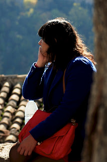
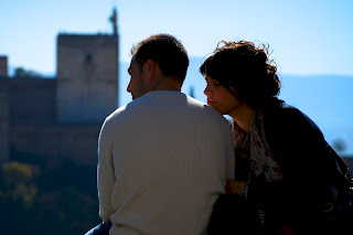
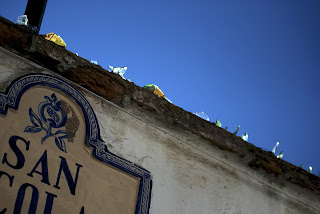
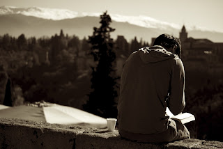
For whoever made it to the end of this post- Congratulations! Now you get to hear the teacher's criticisms of my work. We went to the Mirador de San Nicolás to test the lessons from class on the field. Our work was later judged in class. The main criticism that I really took to heart was that the area in focus always has to be greater than the area in focus, and there cannot be a "bandera" (flag) effect in the photo (first an area out focus, then out of focus, then out of focus again). I have a tendency to go a little overboard with playing with depth of field, and occasionally the area out of focus outweighs the focused area and isn't "visually appealing." That's right, the teacher said to me, "este no sirve para nada" (it's not worth anything- to the professional artistic community, that is) to a few of my photos. A pretty harsh criticism to take. That's not to say that I didn't defend my work-- I'm not one to think that just because it doesn't follow the rules, it's not worth anything. Either way, I'm making a conscious effort to work on that. Who knows, maybe that style will be "in" amongst the artistic community in the future, and I'll be the forerunner. Take that, Rubén. :)
PS-
When I made it home on Sunday night, I immediately bought a better photo editor- Aperture (Apple's photo-editing software). I can now take pictures in .RAW- much better quality than .JPG (I didn't know of the difference in quality, and now I'm scared for my previous photos if the day comes when I want to make prints!).
Interesting site for coming up with color combinations if you can control the colors in your photo: kuler.adobe.com. In order to evoke a sense of calm, use like colors. By contrast, complimentary colors evoke stress.
For more photos from my time at Filmosofía, visit my facebook page!


